This is not another “good riddance 2020 post.” While 2020 was certainly unique in its ability to yield a seemingly endless supply of catastrophes on a collective scale – many individuals have surely faced worse years. Instead, I’d like to take a moment to reflect on what this past year has helped clarify in my life. Full disclaimer: I recognize the privilege and good fortune we continued to enjoy throughout the last year. Both my wife and I were able to sustain our livelihoods, provide for our family, and remain in relatively good health, and for this, we are abundantly grateful.
2020 Taught Me the Value of Good Neighbors & Community
In 2018, we made the decision to sell our home in order to be less car-dependent and live closer to where we work/play. We knew that doing so would be a bit of a sacrifice, as we had a beautiful, new construction home with an even more beautiful view. It would also require at least two moves as well as navigating the cut-throat Park City real estate market. In 2019, after settling into our current home, I wrote in more detail about our decision and thought process, feeling pretty good about the outcome.
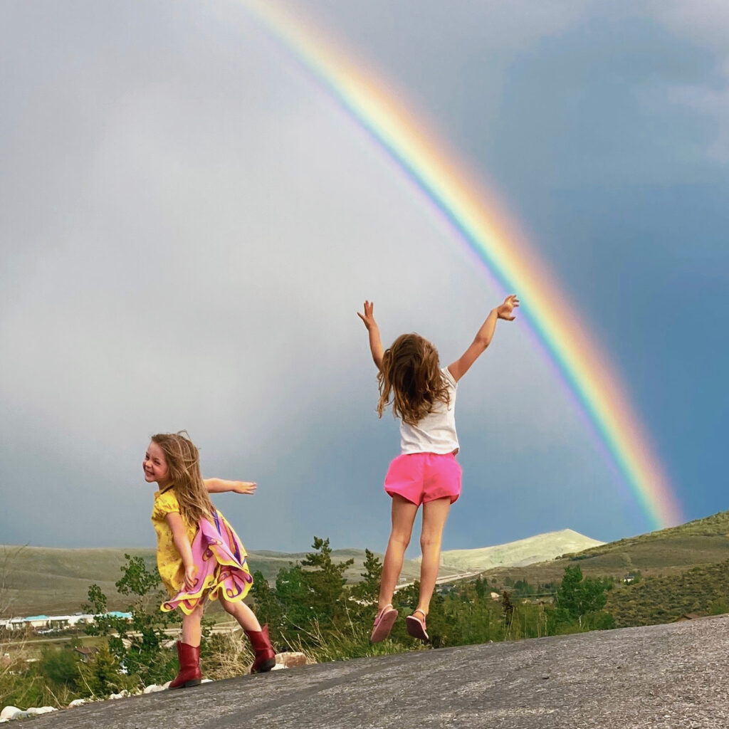
When COVID lockdowns initially hit, it was the first time that I regretted our decision to move, as suddenly, that extra square-footage seemed a lot more valuable. However, looking back at this past year, one of the best things to come out of 2020 was the connections we made within our neighborhood and the lifelong friendships which have emerged. Doubling down on our neighborhood and community proved to be well worth the gamble.
2020 Taught Me the Value of Reading
I read a lot in 2020. As author Ryan Holiday wrote, “The Greatest Shortcut for Leaders Is Reading Books.”
2020 Taught Me That It Can Always Get Worse
There was a three-month span of time in 2020 in which all of the following happened:
- COVID lockdown/ hysteria began (remember the great TP shortage of 2020?)
- Biggest earthquake (locally) in 30 years
- National civil unrest with mass protests and riots
- Received diagnoses that I needed a valve replacement
- My grandpa passed away
While maybe not immediately apparent at the time, all of the above had a silver lining. And as awful as our problems may seem, we should relish them when we can, as they can almost always get worse. One of my favorite meditations is from Naval Ravikant, who said, “A healthy man wants a thousand things, a sick man only wants one.”
Furthermore, negative visualization is a Stoic practice for imagining not having what you have. There were a lot of things we couldn’t do in 2020, but instead of fixating on those, I tried to seek gratitude for what I could do, whether that was tucking a healthy child in bed at night, a bike ride through the mountains from my house, or time spent with friends and family.
2020 Taught Me that Those With Simple Pleasures Are the Richest
As noted above, negative visualization can assist in savoring what we have. With the lockdowns, came the loss of my morning routine, which, now that I have back, I have a greater appreciation for. It’s a simple thing, but that hour every morning I get to read, visualize my day, and walk the dog makes all the difference in my mood and output.
2020 Taught Me that Happiness Comes From Intent
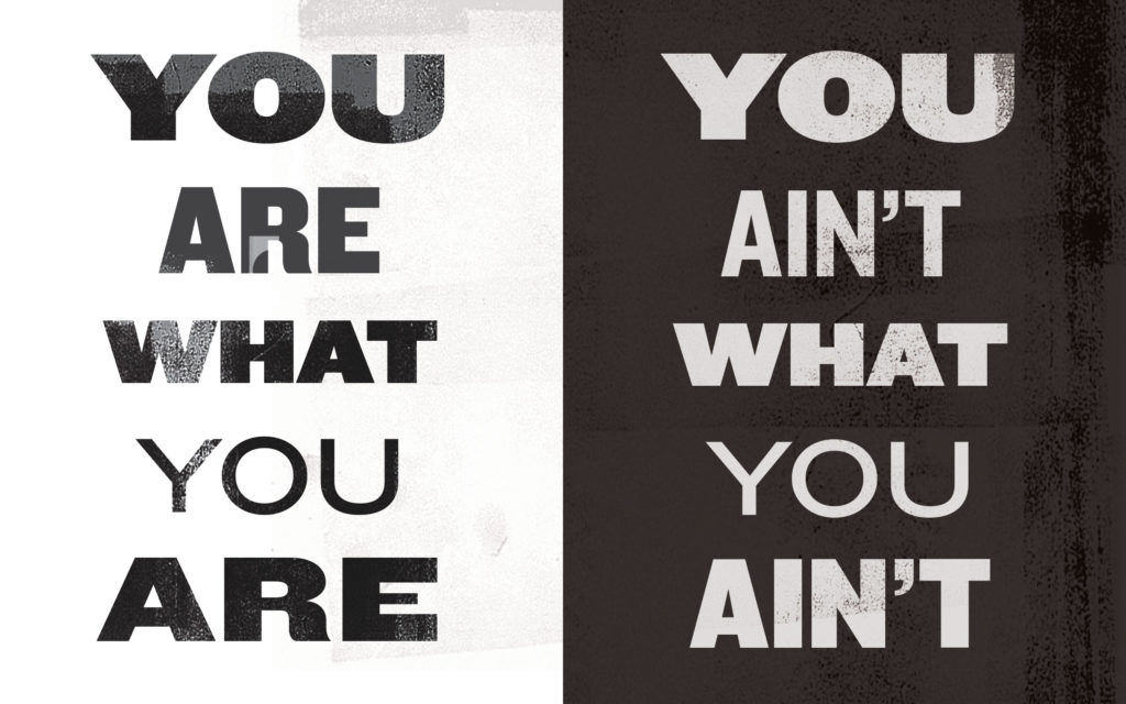
Every moment is a choice in how we react to it, and more often than not, the reaction matters more than the initial action. Many of our actions and reactions occur as a chain of events that ultimately determine our state-of-mind. Checking phones first thing in the morning is a great example of an action that sets off a chain-of-events which lead to a negative reaction and poor headspace. The more present we are in our decisions, and conscious of our attitude towards a person, event, thing, or situation, the better equipped we are to sustain a positive outlook and maintain happiness.
Happiness is not achieved through accomplishment or possession but is instead the result of a series of intentional micro-decisions. We can choose to give someone the benefit of the doubt, overlook a slight, or view a negative through the context of a positive, and if we do it enough times, we will be substantially happier than otherwise. For the joy that comes as a result of something is quick to fade, while joy that occurs without reason persists. Inversely, anxiety and stress come from rejecting, consciously or not, the reality of how things are in the moment.
2020 Taught Me There is No ‘One Right Way’ of Doing Things
I tend to overanalyze decisions, regardless of how trivial. However, what I’ve come to realize, is there is seldom a perfect choice. Each path we take bears its own fruit, for better and worse. All we can do is learn from our experiences, be confident in our decisions, and then sit back and enjoy the ride. Besides, with the exception of a few notable life-choices, such as having a child, or committing a crime, there are few actions that can not be undone should they prove untenable.
2020 Taught Me That These Are the Goold Old Days
Throughout the last year, many of us found ourselves looking ahead to better days. It’s all too easy to pend our happiness on future events, ie; a new president, a vaccine, accomplishments, accolades, and so forth. However, Lord willing, these are the days that we will one day look back on with nostalgia, and if we continue to run out the clock on our days, weeks, and months, our time will have passed before we know it.
For everything we do, there will be “a last time” we do it. So next time you find yourself in a seemingly mundane or repetitive task, change your perspective from “have-to-do,” to “get-to-do.”
If you enjoyed this post, you might also like Finding Joy While Running the Hedonic Treadmill of Life.