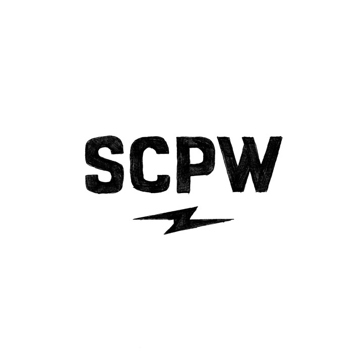
We left off with Part 2 of my logo process with a set of refined sketches. The next step is presenting the sketches to the client and determine a final direction, as well as gather any potential feedback they may have. In this case, the client felt the above sketch best communicated the intended brand and most reflected the audience. To see the other sketches, go back to Part 2.
After client sign-off, I make any additional tweaks to the sketch I see fit with pencil and paper. In this case, I feel it’s pretty close to the intended result and any additional tweaks can easily be addressed on the computer, so I scan it and begin the digitization process. Working in illustrator using shapes and the pathfinder tools I vectorize the sketch and make the necessary alterations to the final letter-forms.
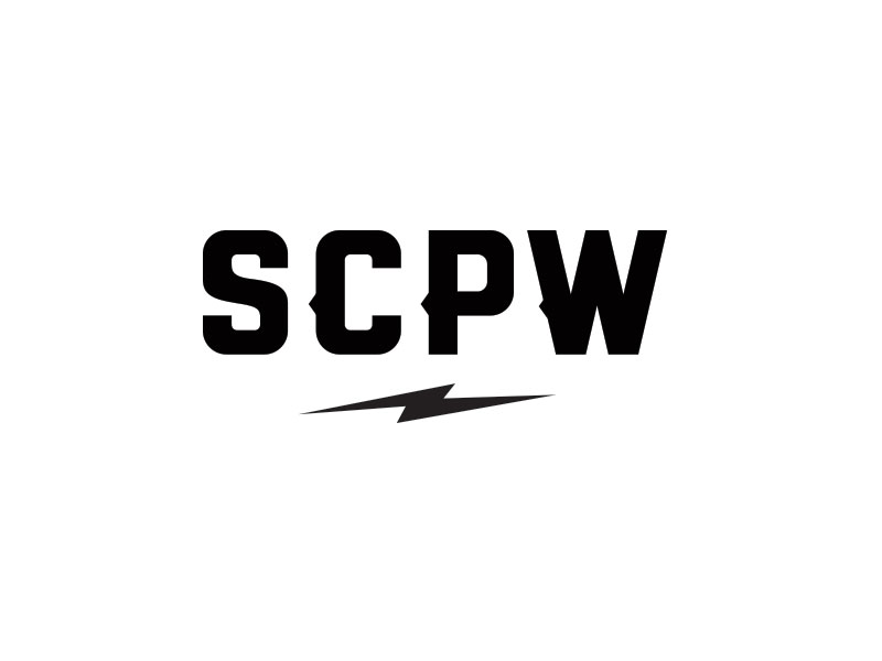
Early in the process we determined that the core mark would be the SCPW. From there, I’d deliver additional variations that took into account the full name of the organization.
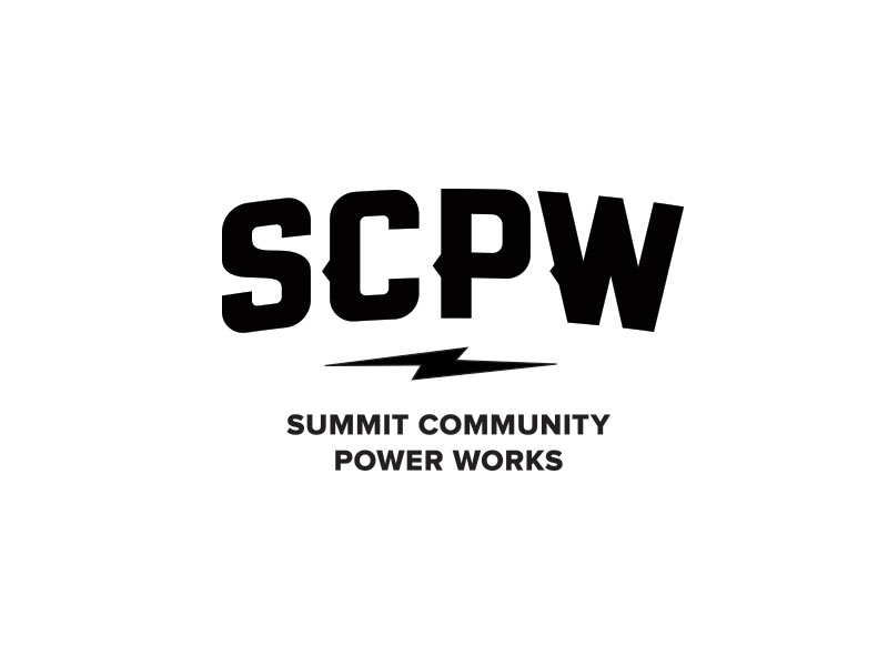
Above is the full Summit Community Power Works logo.
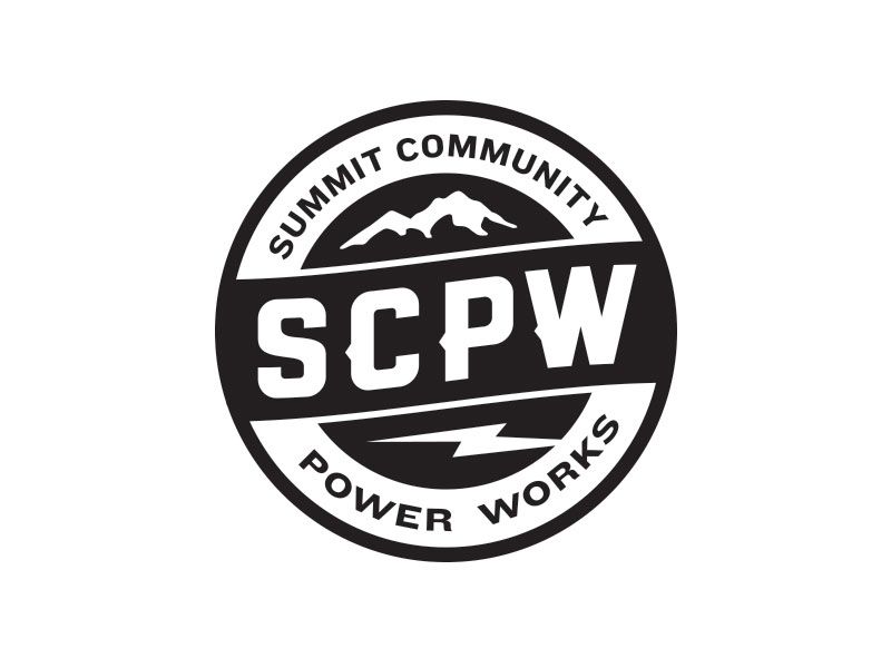
Additionally, given the industry, we liked the idea incorporating a badge treatment into the brand, which can be seen above.
With final mark and logo variations intact, I now send to the client for final approval.
There it is, my full logo process from start to finish. I’m more than stoked on the way the final result came out, and even more importantly, so is the client. If you’re a designer, please chime in with any questions or feedback, as well as thoughts on your own process.
If you’re in the market for a new logo or identity, or simply need to tweak your existing brand feel free to reach out with any questions.