Everyone knows that a logo is the backbone of a brand, however, this post isn’t about the value of a well designed logo. Instead, it’s intention is to highlight the fact that the creation of a logo doesn’t need to be a long, drawn-out process. While setting expectations and maintaining open communication is critical to the process, sometimes what is needed most simply is making a decision and standing by it. Too often we get caught up in analysis paralysis. The amount of information readily accessible at our fingertips seems to only add to the stress of decision making. At a certain point, the details we often get hung up on, simply don’t matter that much, and it’s better to make a decision and move on.
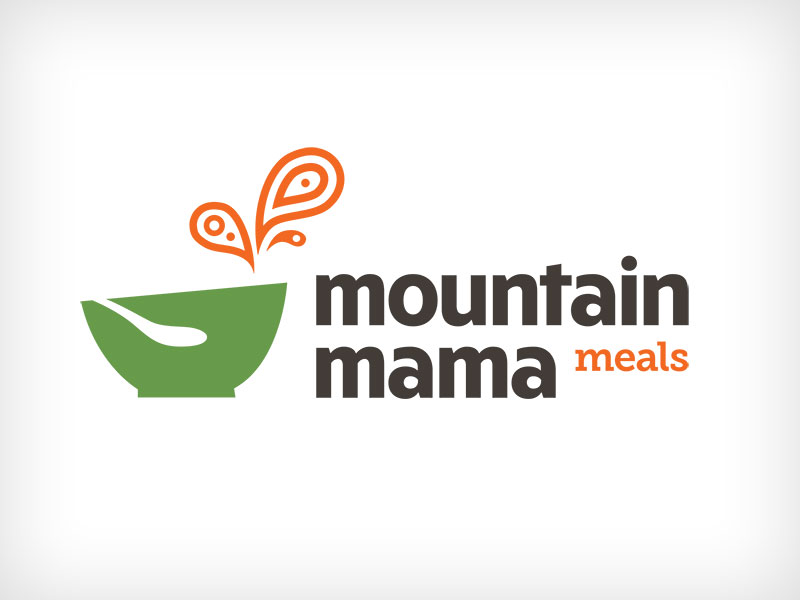
With that said, I had the pleasure of working with my good friend Peregrine on a logo for her new business, Mountain Mama Meals. She had an extremely tight timeline, however, quick turn-arounds are often blessings in disguise as they tend to keep projects on point with no room for excessive analysis or over-thinking things. Together, we knocked out the above logo in four days, from concept to delivery. Would the end result have been better had it taken 3 weeks or 3 months or a allowed for enough time draw a custom font, or execute tightly on an abstract concept to make it a truly award-worthy piece? Perhaps, but that sort of thing is more about buffing out the awards section on a designers Linkedin profile and in reality, adds very little value to the client or their business.
Instead, Peregrine received a solid mark that looks great in one-color and on her website that will grow with the brand and business. If down the road it needs to be refined, then we have a great foundation in place to build from.
Logo in Four Days – Here’s How We Did It:
1. Day 1 – The Concept
In today’s society, the hard part isn’t finding inspiration, but instead, filtering through the abyss, as there are infinite potential options and directions one can go. The pros all know that the path of true creativity can only be achieved through constraints. Think about how many of the best songs in the world only use 3 chords or stay within the same scale. For the most part, they’re all rather formulaic. So we laid out the knowns, and then solved for X
The knowns: 1) Must look good on a website. 2) Combination Mark, meaning symbol + words 3) Playful aesthetic 4) Should reflect the product ie; healhty & delicious home cooked meals delivered to your door.
With the above criteria for a successful logo established, we hopped on a call and had a quick creative brainstorming session. By the end of the call, we had the concept locked down and signed off on, with a rough sketch of our idea.
My notes from the call read: Bowl mark w/ funky or paisley steam. “Mountain Mama Meals” with playful (no punctuation) type treatment.
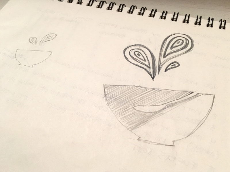
Above is the quick rough I sketched out after the call.
2. Days 2 – Execute
With the concept in place, it was now up to me as the designer to execute on the directives we had laid forth. I had a rough idea for the style of font to use – a bold, san-serif font most likely set in lowercase. This would give it that “playful” element that I felt Peregrine was after. Additionally, I always try to pair contrasting fonts together when possible, and I felt a lighter weight slab-serif would complement the heavy strokes of the primary font nicely. In terms of the mark, I had a solid mental image of how I wanted it to turn out, however the challenge here was adding enough just enough flourish, but not too much, so it would retain it’s structure and legibility at smaller scales, as good logos must.
Day 3 – Revise
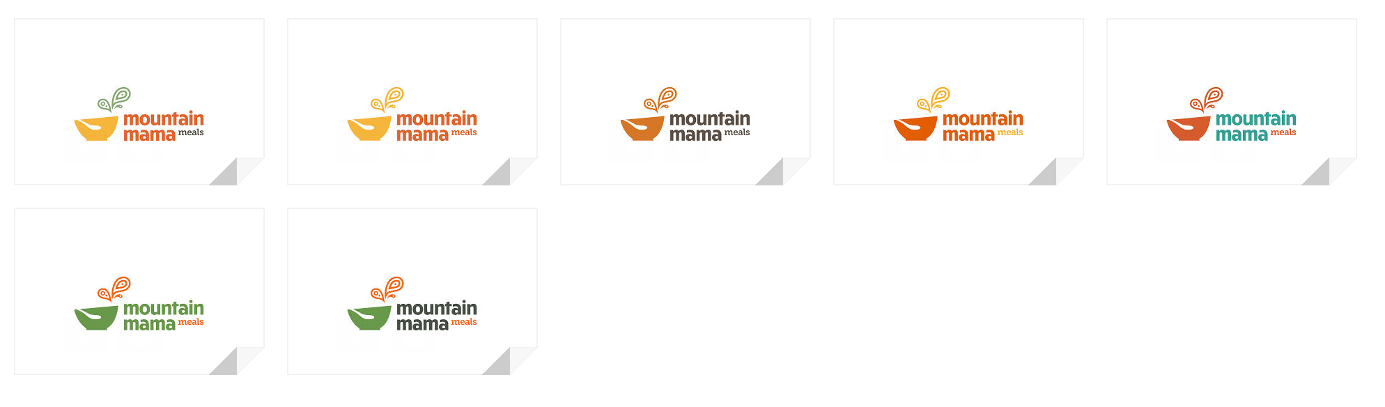
One of Peregrine’s critiques, is that the plumes could be interpreted as splashes. She also requested a few slight tweaks to the font treatment. I tweaked the font as requested, as well as presented a few more options for the steam treatment (above). Ultimately, we stayed with the original direction which still has a bit of a “splash” element to it, as we determined that it adds to the overall “playfulness” which was inline with our original values for the logo.
Day 4 – Finalize & Deliver
With the mark largely complete, the final step was to present some color options before adding color into the final mark and delivering the files. Previously she had mentioned she liked the thought of a green & orange color scheme, so while there were an array of options, ultimately we settled on her initial instinct.
Need a logo for an upcoming business idea or feel your current brand is feeling a little stale? Get in touch and let’s work together to make something great!