A couple weeks back, I wrote about my decision to consider mobile first for my upcoming site redesign. And as promised, today I’ll outline how mobile first influenced decisions made throughout the design process.

Treading Lightly
We use mobile to fill in the gaps of our lives. If we have to wait while we are waiting, we’ll likely move on. Similarly to building a bike, it is important for the build to be lightweight without sacrificing performance or aesthetics. Utilizing CSS wherever possible, keeping JavaScript calls to a minimum, and not serving up unnecessary images were all decisions I made in an attempt at keeping the site light and nimble.
Organization
Our behavior on a mobile device is different from that of a notebook or tablet. Perhaps it can be attributed to our limited attention spans, or the fact that we’re mostly on the go when using mobile. As such, it’s safe to assume that we are looking to complete 1 of 2 potential tasks: 1) Avoid boredom 2) Access location or contact info.
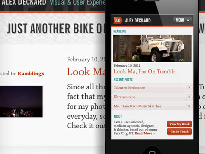
Since my site is primarily a personal blog/portfolio, I’m going to assume that most user’s are looking to fill in that gap while they’re waiting in line at the grocery store, or god forbid, while they’re driving. So I’ve decided to give my latest posts the most emphasis in terms of site hierarchy. After that, I’ve included a short blurb about myself, as well as a couple links to other relevant content, such as my portfolio page and contact information.
Navigation
Time is precious. And because this rings (ahem) especially true in the mobile world, I need to get right to the heart of the content as soon as possible. In his book Mobile First, Luke Wroblewski stresses that content should take precedence over navigation. While it would be easy to spec the page out with menu options that run the length of the device, that seems like a waste of both bandwidth and attention span. The goal here is to transport users to rich, meaningful content in as few clicks, or in this case touches, as possible.
After landing on the home page, readers are given a headline and excerpt from my latest post, as well as the headlines of a few of my other recent posts. In addition, I’ve included a short blurb about myself and relevant links to both my work and contact information. Having these content elements on the page accomplishes a number of goals: 1) User’s coming to my site looking for a quick fix are thrown right into my recent posts. 2) I’ve created relevant pivot points for users coming to the site looking to view my work or get in touch with me. 3) I’ve kept the majority of the content on the page, for lack of a better term, “above the fold” without wasting time or real estate with irrelevant menu items.
Actions
Small devices require large buttons. With mobile, we don’t have the pixel-perfect precision that a mouse affords, and therefore must build in a margin for error with our buttons and links. There are standards regarding appropriate button size, however only by building and testing will you be able to accurately measure ease of use. Placing buttons with different functions in close proximity is another mobile faux-pas, as we need to build in a sufficient margin for error in our layout.
Additionally, the way we physically use a mobile device is different than that of a notebook or desktop. Generally speaking, we hold the device in our palm and utilize our thumb as a big erroneous mouse. As such, unless you are blessed with incredible long and nimble thumbs, it is easier for us to reach the bottom half of the screen than it is the top. For this reason, I’ve designed the site so that the menu is located near the bottom of the device, and have utilized basic anchor links to jump from the top to bottom and back. My thinking being: 1) It keeps the header area clean and stays inline with our “Content over navigation” approach. 2) Allows the user to more easily navigate with their thumbs by keeping the menu in the device “sweet spot”. 3) Using anchor links in place of more intensive JavaScript actions keeps the navigation lightweight.
Layout
We’ve already hit on most of what drove the site layout in the previous paragraphs. Keeping the page lightweight, drilling content down to what matters most, giving content precedence over navigation, and examining how users physically use and hold the device are all factors that heavily influenced the layout. As I start marking up the site for larger screen resolutions, I’ll be using media queries to serve additional styles and images, or progressively enhancing the site to deliver an experience that is tailored to larger screen sizes.