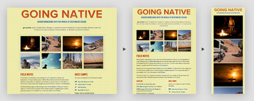
To see the live site in action, click here.
As a web designer, I have always been frustrated with the lack of control I have over how the user views my design in a live environment. Between inconsistent window sizes, x-browser conundrums, and a limiting screen-font selection, my original Photoshop output is rarely seen in all it’s glory by the end-user. Add-in small screened mobile devices and the valley grows deeper.
However, as more browsers adopt web-standards and web-type gets more sophisticated, we’re starting to see more flexibility and close-in-on the divide. By using media queries to serve stylesheets and layouts based on window and device size we can narrow the gap even further with a responsive design. While not totally future-proof or without limitations, fluid layouts are a best practice and a great way to prepare for the future of web design.
I’ll be writing about my process in more detail in the days to come, but for now head over to the site and view my first foray into responsive design in action.